
Typography Fundamentals: Choosing the Right Fonts for Your Website (and Business)
And why it matters more than you think
Fonts are the unsung heroes of your website. They shape how your message is received, guide the visitor’s eye, and help establish your brand’s tone — all before anyone even reads a word.
Choosing the right fonts isn’t just about picking something “nice” — it’s about matching your business personality with typography that communicates clearly, looks great, and works well across all devices.
Why Fonts Matter
Typography directly influences how people perceive your business:
Is your brand serious or playful?
Are you luxury or budget-friendly?
Is your message clear and trustworthy, or cluttered and chaotic?
Your type choices tell that story at a glance. Especially for consultants, service providers, and professional businesses, the right font builds credibility instantly.
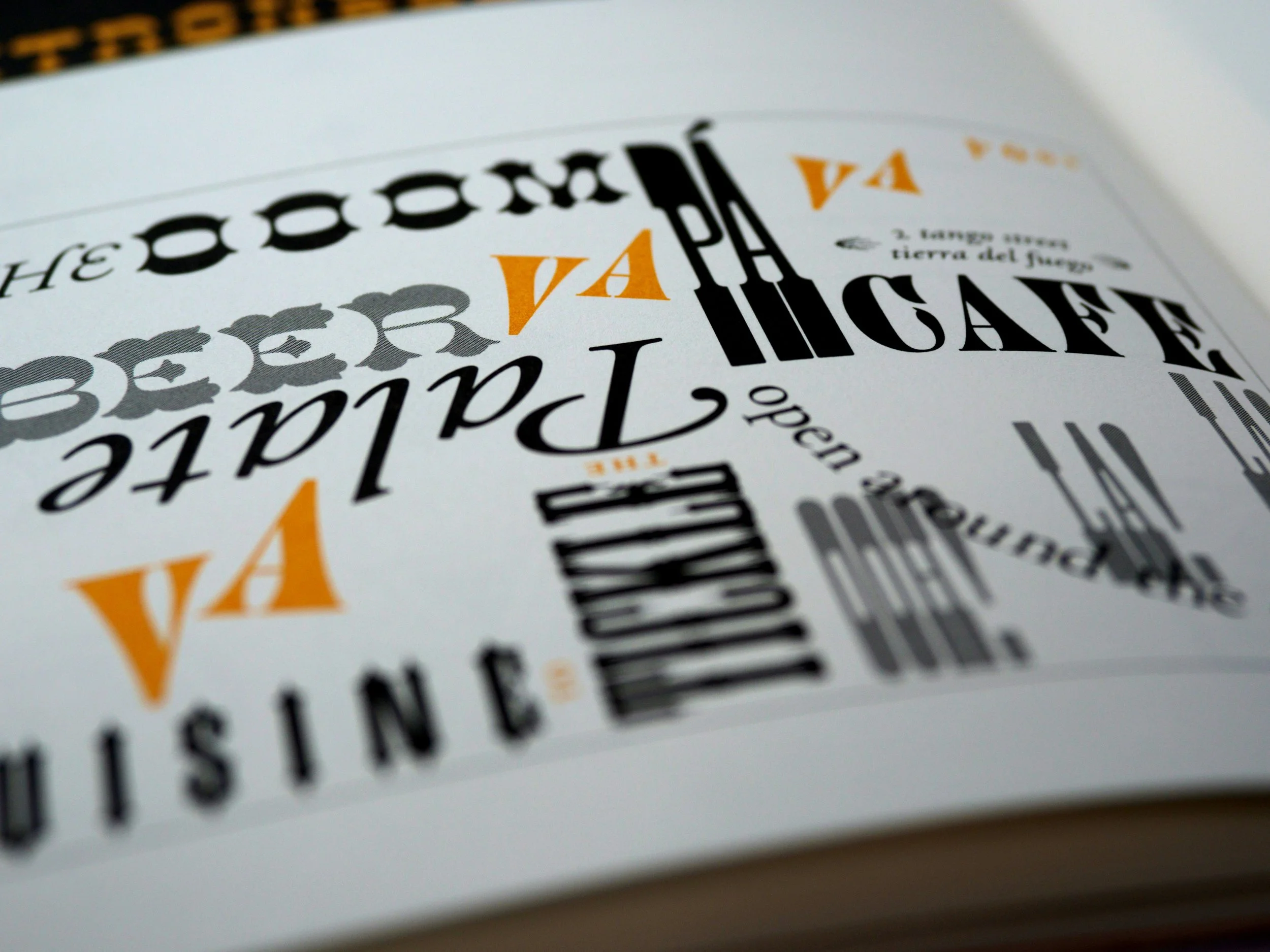
The 3 Main Types of Fonts
Let’s break it down:
Serif – These fonts have little “feet” at the ends of letters. They feel classic, refined, and reliable.
Best for: Consultants, legal services, financial advisors, editorial brands.
Examples: Times New Roman, Georgia, Playfair Display.Sans-Serif – Clean, modern, and no-nonsense. These fonts work beautifully online and on mobile.
Best for: Designers, tech professionals, service-based businesses.
Examples: Helvetica, Arial, Montserrat, Lato.Script/Handwritten – Decorative and expressive. These fonts bring personality, but should be used sparingly.
Best for: Artists, boutique shops, creative consultants, or personal brands.
Examples: Pacifico, Great Vibes, Dancing Script.
Tips for Choosing Your Website Fonts
Stick to Two Fonts
One for headings, one for body text. This keeps your site easy to read and visually balanced.Make It Readable
Your body font should be clean and simple. Avoid thin, elaborate, or novelty fonts for paragraph text.Use Hierarchy
Headings draw the eye. Subheadings break up content. Body text shares the details. Make sure each is visually distinct.Font Pairing Tools Help
Try fontpair.co or Google Fonts to test out pairings that look polished and professional.Reflect Your Brand Vibe
Artists/Makers: Try a playful, artistic heading font with a clean sans-serif body font.
Holiday Property Owners: Choose soft serif fonts or rounded sans-serifs for a warm, welcoming feel.
Boutique Shops: Think elegant serif for headings and clean modern sans-serif for body text.
Consultants & Professionals: Choose fonts that signal clarity and confidence — such as a strong serif for headings and an easy-to-read sans-serif for body copy.
Bonus Tip: Website Speed Counts
Only load the fonts and weights (regular, bold, etc.) you need. Stick with web-safe or Google Fonts to avoid slowing down your site.
In Summary:
✔ Keep it legible
✔ Use just two fonts
✔ Match your brand’s tone
✔ Think mobile-first
✔ Let typography support — not distract