
What Is Responsive Design and Why Does My Website Need It?
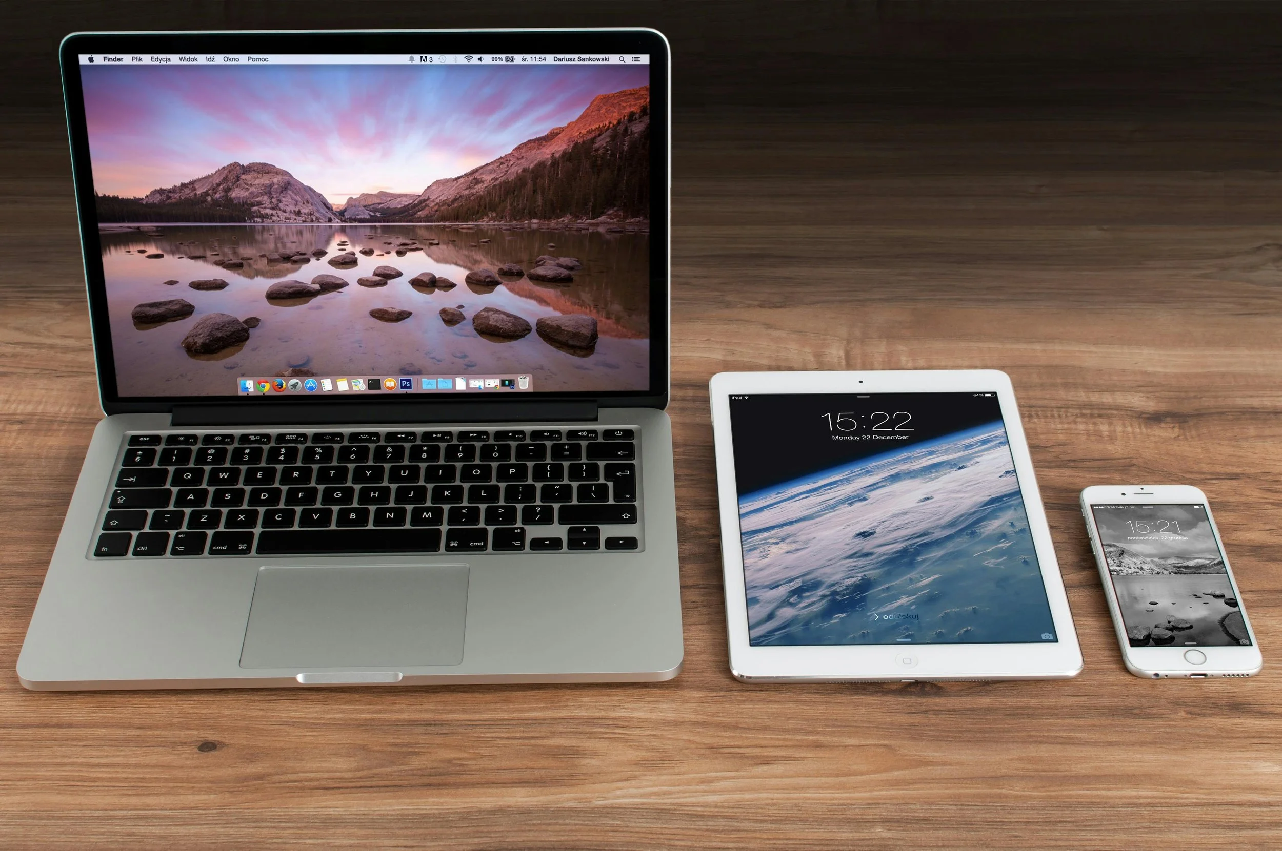
In today’s multi-device world, your website needs to look great and work smoothly whether someone visits it on a phone, tablet, or desktop, computer.
Responsive Design is the magical method of making your website look brilliant and easy to use no matter what device someone is viewing it on. That’s where responsive design comes in.
What Is Responsive Design EXACTLY?
Responsive design is an approach to web design that makes sure your website adapts to the screen size and device being used. Instead of building separate versions for desktop and mobile, a responsive site uses flexible layouts, images, and CSS media queries to automatically adjust how content is displayed.
In short:
Your website responds to the size of the screen it’s being viewed on!
How Does It Work?
Behind the scenes, a bit of enchanted code (usually CSS media queries) tells the website:
“If the screen is this wide, show it like this... but if it’s smaller, rearrange things like that!”
It’s like your website wearing the perfect outfit for every occasion, whether casual (phone) or formal (desktop)!
Real-Life Example
A 3-column layout on desktop might:
collapse into 2 columns on a tablet
stack into a neat single column on a phone
Menus become dropdowns. Images scale down. Fonts adjust automatically.
Why Is It Important?
In this age of mobile-first everything, your audience could be visiting your website:
while sipping coffee and scrolling on their phone
on a laptop during work hours
from a tablet on the sofa
so it gives you and your website viewers:
Better User Experience: Visitors can easily navigate and read your content without pinching, zooming, or squinting.
SEO Benefits: Google favours mobile-friendly websites in search rankings, which can help your site get found more easily.
Faster Loading Times: Responsive websites tend to be more lightweight and load faster—especially important on mobile.
Future-Proofing: As new devices emerge (like foldables or extra-wide monitors), a responsive site is more likely to handle them without major changes.
A responsive website:
✅ Adapts layout to fit screen size
✅ Resizes images so they don’t overflow or shrink too small
✅ Keeps fonts readable and buttons tappable on small screens
✅ Improves user experience — visitors stay longer, browse more
✅ Boosts SEO — search engines love mobile-friendly site
How Can I Tell if My Website Is Responsive?
Try resizing your browser window or visiting your site on different devices. If the layout shifts, the text resizes, and navigation remains user-friendly, it's likely responsive.
Or, use Google’s Mobile-Friendly Test tool for a quick check.
Final Thought from david & George
Responsive design isn’t a trend — it’s the new normal. Your website must look good on all screens to connect with modern audiences. It improves user experience, increases your chances of ranking in search engines, and ensures your site feels modern and professional no matter how people visit. And luckily, platforms like Squarespace (which we are and you may be using) already build responsive design into their templates.
If you're not sure whether your site is responsive or you need help making it so, just get in touch—we're here to help!