
How to Take Better DIY Photos for Your Website
How to Take Better DIY Photos for Your Website
No fancy gear. No stress. Just simple tips that make your photos shine.
We get it — booking a professional photographer isn’t always possible right away or affordable at the beginning of your business.
But that doesn’t mean you have to settle for blurry, badly-lit photos on your website. With a smartphone, some daylight, and a little guidance, you can take photos that look clean, confident, and genuinely you.
Here’s how.
1. Use Natural Light (Whenever Possible)
Skip the overhead bulbs — they cast shadows and weird colours.
Instead:
Set up near a big window
Shoot in the morning or late afternoon (not harsh midday sun)
Turn off indoor lights to avoid yellow/orange colour casts
If it’s too bright, use a sheer curtain or white sheet to soften the light
Soft, natural light = clean, fresh website photos
2. Think About What You Want to Show
Before you start snapping, ask:
What do I want visitors to see or feel?
What parts of my work or world should I show?
Do I want to look creative? Calm? Friendly? High-end?
Try to capture:
You at work (even candid, behind-the-scenes shots!)
Your products, process or tools
Your workspace or studio
Close-up textures and details
Smiles, hands, movement — they humanise your brand
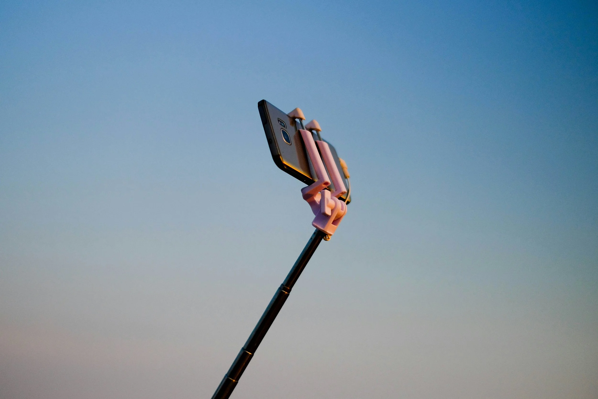
3. Steady Your Camera (Tripod or Not)
Blurry = unusable.
Ways to steady your phone:
Use both hands, rest your elbows on a surface
Lean against a wall or table
Use a basic phone tripod or even a stack of books
Use the timer or remote shutter so you don’t nudge it
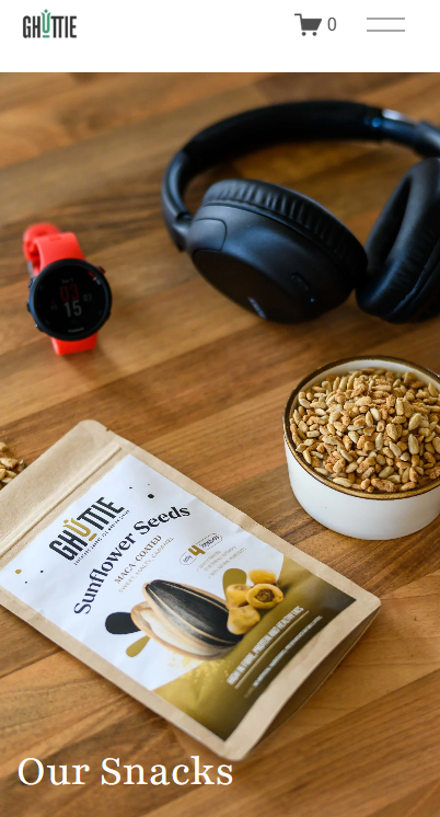
4. Clear the Clutter
Look at the whole background — not just the subject.
Tidy up anything distracting like tangled cables, mugs, or bins.
Neutral, calm backgrounds make your subject shine.
Tips: Try shooting against:
White walls
Wooden tabletops
Fabric backdrops (throws, sheets, scarves)
Painted boards or textured paper
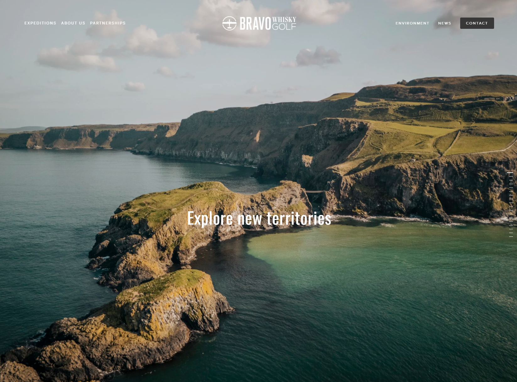
5. Shoot Horizontally and Vertically
Website design uses both landscape and portrait shots.
Horizontal (landscape) is great for banners and galleries
Vertical (portrait) is ideal for phone views, headshots, social
Take a few of each — we’ll thank you later!
6. Editing Is Your Friend (But Go Gently)
A little editing helps:
Crop to centre your subject
Lighten up dark shots
Boost contrast slightly for clarity
Straighten skewed photos
Only if you know how to!
Use built-in tools or free apps like:
Snapseed (iOS + Android)
VSCO
Canva (for cropping and overlays)
🖤 Bonus Tip: Black & White Can Be Beautiful
Don’t underestimate the power of a strong black-and-white photo — especially for:
Portraits
Detail shots
Studio or workspace moments
Artistic products or handmade processes
Black and white can help:
Remove visual “noise” from a busy background
Create mood or atmosphere
Bring out contrast, texture and emotion
Use it intentionally, sparingly — and your website can feel timeless, creative, and confident.
Avoid using only black-and-white across your whole site (unless that’s your brand style), but adding a few bold monochrome shots can be wonderfully striking — especially when paired with colour elsewhere.
7. Think Website First
Keep in mind how the photos will be used:
Leave space around your subject so we can crop if needed
Don’t zoom in too tightly — wide shots can be more flexible
Try a mix of shots: full scene, mid shots, close-ups
Want a shot across your homepage? Try stepping back and leaving negative space on one side — great for text overlays!
Final Thought from David & George:
You don’t need a studio or a DSLR to make a big visual impact.
Just a bit of thought, a burst of natural light, and your unique style — that’s all it takes to create beautiful, real photos that help your website come alive.
And remember: done is better than perfect.
You can always upgrade later — but what you have now is more than enough to begin!
Do you have any questions for us? Let’s Talk!

DISCLAIMER
This article is an original article written by David @ David&George - one of the UK’s leading Squarespace website designers. All opinions are the writers own and no liability will be taken for any errors or omissions. As Squarespace designers we will perhaps be a bit biased towards all things Squarespace - but Squarespace is such a game changer that we are its biggest fans. As web professionals we have seen how our clients love the control they have & the designs that are possible at reasonable cost. We would not work on any other platform!!
COPYRIGHT
The author retains full copyright over this article. Reproduction in whole or part is only permitted with prior written permission of the author with credit and backlink.