
Using Images Effectively on Your Website
Using Images Effectively on Your Website
Designed by David & George
How to choose, prepare, and place visuals that look great, load fast, and convert.
Great images don’t just decorate a page—they steer attention, build trust, and drive action. Here’s a concise guide to getting them right from selection to SEO.
1) Choose the right kind of image
Relevance first: Every image should clarify a point (product detail, result, location, team) or spark emotion that supports your message.
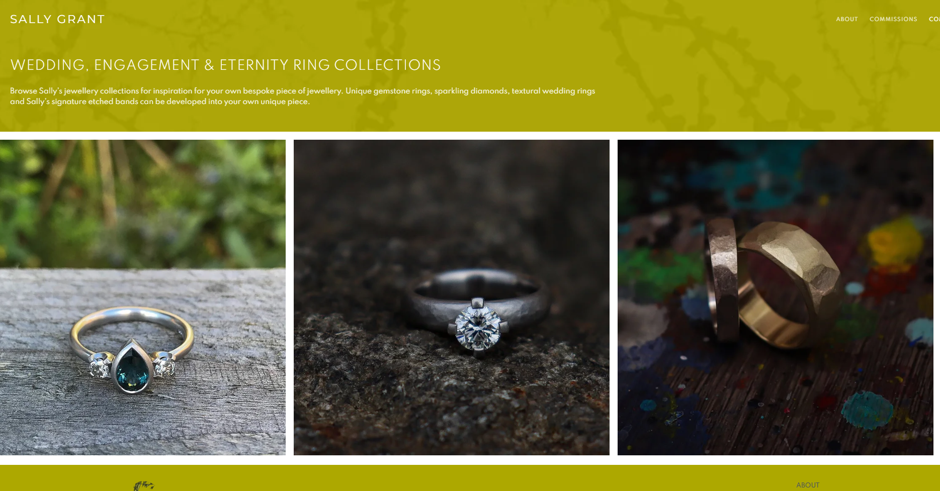
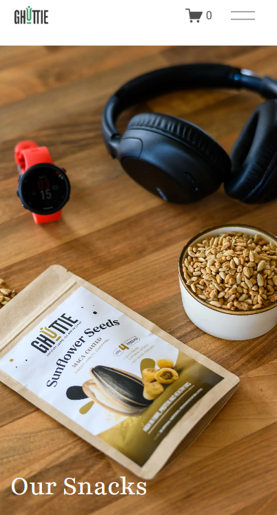
Authenticity wins: Real photos of your work, space, or people consistently outperform generic stock. If you must use stock, choose natural, candid styles.
Consistency = brand: Stick to a visual style (color tone, lighting, composition) so the site feels cohesive.
Diversity & inclusion: Reflect the real audience you serve.
2) Compose for the web
Clear subject & breathing room: Simple backgrounds and strong focal points read better on mobile.
Think in crops: Design for multiple aspect ratios:
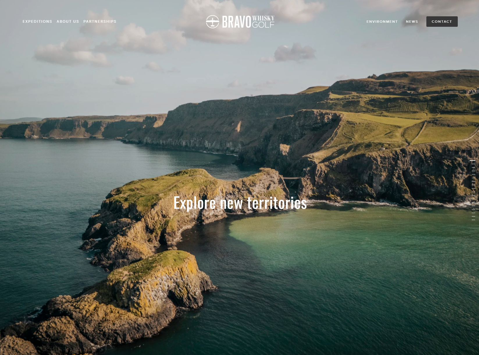
Hero banners: 16:9 or 21:9
Cards & thumbnails: 1:1
Portraits: 4:5 or 3:4
Project shots/blog: 3:2 or 4:3
Add direction: Choose images where the subject “faces” your headline or CTA to guide the eye.
3) Prepare files for speed and quality
Resolution: Export close to the largest displayed size (e.g., 2400–3000 px on the long edge for heroes; 1200–1600 px for most content).
Formats:
JPG/JPEG for photos
PNG for transparency/graphics
WebP for smaller, modern compression (use where supported)
SVG for logos/icons (crisp at any size)
Compression targets: Aim for 100–300 KB for inline images, 300–600 KB for full-width heroes (higher only if necessary). Use tools like Squoosh, TinyPNG, or built-in export settings.
Color & pop: Lightly adjust exposure, contrast, and white balance. Avoid heavy filters that clash with your brand palette.
4) Place images with purpose
Pair with copy: Every major section benefits from one strong image that reinforces the headline.
Avoid wallpapering: Fewer, better images outperform many mediocre ones.
Use captions sparingly: Helpful for context (case studies, portfolios), unnecessary for purely decorative visuals.
Black & white for mood: Use B&W to create focus or cohesion—especially for team pages or editorial posts—just keep it consistent.
5) Accessibility & SEO (quick wins)
Alt text: Describe the content and purpose—what a screen reader user needs to know (“Hand-thrown ceramic mug in speckled glaze”).
File names: Use descriptive, hyphenated names (e.g., studio-ceramic-mug-speckled.jpg).
Structured placement: Put critical images near relevant headings and copy; search engines read context.
Avoid text in images: Use real HTML text over photos for readability and SEO.
6) Performance best practices
Lazy loading: Ensure below-the-fold images load on scroll.
Responsive sizing: Serve appropriate sizes for mobile/tablet/desktop (most builders handle this—double-check).
CDN: Host images on a content delivery network for faster global load times.
Audit regularly: Test with PageSpeed Insights or Lighthouse; replace heavy offenders.
7) Legal & practical musts
Licensing: Only use images you own, licensed stock, or explicit client-provided assets. Keep proof of license.
Consent: Get permission for identifiable people; use model releases for commercial use.
Backups & versions: Keep originals safely stored; export web versions from those.
Quick Checklist (copy/paste friendly)
Image supports the section’s message
Style consistent with brand (colour/lighting)
Cropped to suitable ratio (hero/cards/portrait)
Optimized format & size (JPG/PNG/WebP/SVG; 100–600 KB)
Descriptive file name + meaningful alt text
Placed near relevant copy; no text baked into image
Lazy-loaded and responsive sizes enabled
Proper license/consent confirmed
Bonus: Squarespace tips
Use Image Blocks and Galleries; set the Focal Point so important subjects don’t crop awkwardly on mobile.
Upload SVG logos where supported; otherwise high-res PNG with transparency.
Squarespace auto-generates responsive sizes and lazy loads images—still compress before upload for best results.
Use images as strategic tools, not decoration. When every visual has a job—inform, reassure, inspire—your site feels faster, clearer, and more persuasive.
Your business does not have a website yet? Let’s Talk!

DISCLAIMER
This article is an original article written by David @ David&George - one of the UK’s leading Squarespace website designers. All opinions are the writers own and no liability will be taken for any errors or omissions. As Squarespace designers we will perhaps be a bit biased towards all things Squarespace - but Squarespace is such a game changer that we are its biggest fans. As web professionals we have seen how our clients love the control they have & the designs that are possible at reasonable cost. We would not work on any other platform!!
COPYRIGHT
The author retains full copyright over this article. Reproduction in whole or part is only permitted with prior written permission of the author with credit and backlink.