
Colour Psychology: Choosing the Right Palette for Your Website

And why it matters more than you think
When it comes to your website, colour isn’t just decoration — it’s communication. Colours speak directly to our emotions, influence how we feel about a brand, and even affect our decision-making. That’s the power of colour psychology — and choosing the right palette can make your website not only beautiful, but effective.
Why Colour Matters
Your colour palette sets the tone for your brand. It can tell your visitor whether your business is relaxed or bold, fun or formal, artistic or corporate — all in a split second.
Think of it like the background music to a film: subtle, but incredibly influential.
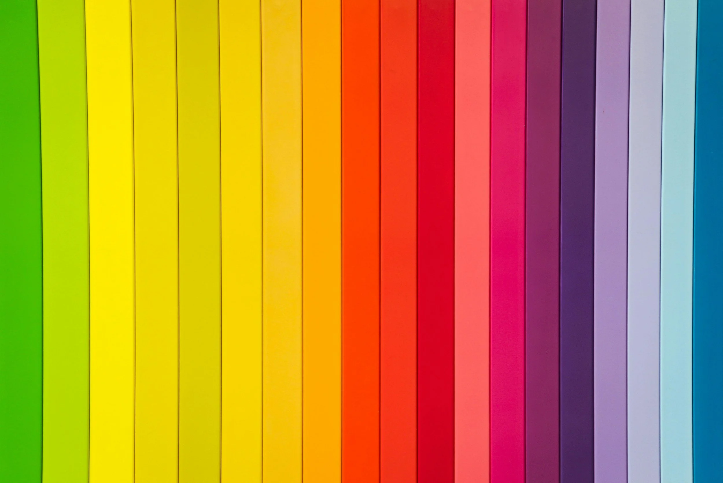
The Basics of Colour Psychology
Here’s a quick guide to what common colours tend to communicate:
Blue – Trust, professionalism, calm (great for coaches, consultants, or corporate services)
Green – Nature, balance, health (ideal for eco-conscious brands, wellness, or outdoor products)
Red – Passion, urgency, excitement (works for bold brands or calls-to-action)
Yellow – Optimism, warmth, energy (perfect for creative or youth-oriented businesses)
Purple – Luxury, creativity, spirituality (lovely for beauty brands or artistic businesses)
Black/Grey – Sophistication, authority, minimalism (suits boutique or high-end services)
White/Neutral tones – Simplicity, clarity, cleanliness (ideal for airy, calm, lifestyle-focused brands)
Tips for Choosing Your Website Palette
Start With Your Brand Personality
Ask yourself: What feelings do you want your site to evoke? Trust? Creativity? Calm? Pick colours that match.Choose a Primary Colour
This is your “hero” colour — the one that should dominate key elements like buttons, links, and headings.Add Supporting Colours
Choose one or two secondary colours that complement your main colour. These can be softer shades or contrasting tones used for accents.Keep It Consistent
Stick to your palette throughout your site to create a cohesive and professional feel.Use Tools for Help
Free tools like Coolors.co or Adobe Colour can help you build beautiful colour schemes in no time.
Examples in Action:
Artist/Maker? You might lean into earthy neutrals with pops of rich jewel tones to show creativity and depth.
Holiday Property Owner? Cool blues, soft neutrals, or sun-washed tones can evoke relaxation and seaside charm.
Boutique Business? Think elegant black and white with a splash of gold, or soft blush tones with sage green for a timeless and modern feel.
One Last Thought from David & george:
Don’t forget accessibility — make sure there’s enough contrast between your text and background colours so everyone can enjoy your content with ease!


DISCLAIMER
This article is an original article written by David @ David&George - one of the UK’s leading Squarespace website designers. All opinions are the writers own and no liability will be taken for any errors or omissions. As Squarespace designers we will perhaps be a bit biased towards all things Squarespace - but Squarespace is such a game changer that we are its biggest fans. As web professionals we have seen how our clients love the control they have & the designs that are possible at reasonable cost. We would not work on any other platform!!
COPYRIGHT
The author retains full copyright over this article. Reproduction in whole or part is only permitted with prior written permission of the author with credit and backlink.